Featured

Ferris Wheel Press Inks

First of all let me wish you all a very Happy New Year 2024. Starting a new year with new products is the best thing an artist can ask for! As an artist, I’m deeply inspired by colors. They motivate and uplift me so that I can create pieces that uplift others.

So naturally I was thrilled when I was invited to join the Creative Ambassadors Program at Ferris Wheel Press, a design and stationery company based in Canada. This company is a fountain pen ink – heaven! I can’t get my head around their gorgeous and extensive assortment of colors.

This month I got a chance to explore and review two such colors – a deep periwinkle blue color, Harlequin Dream and a shimmering pink called Radiant Rosewing!

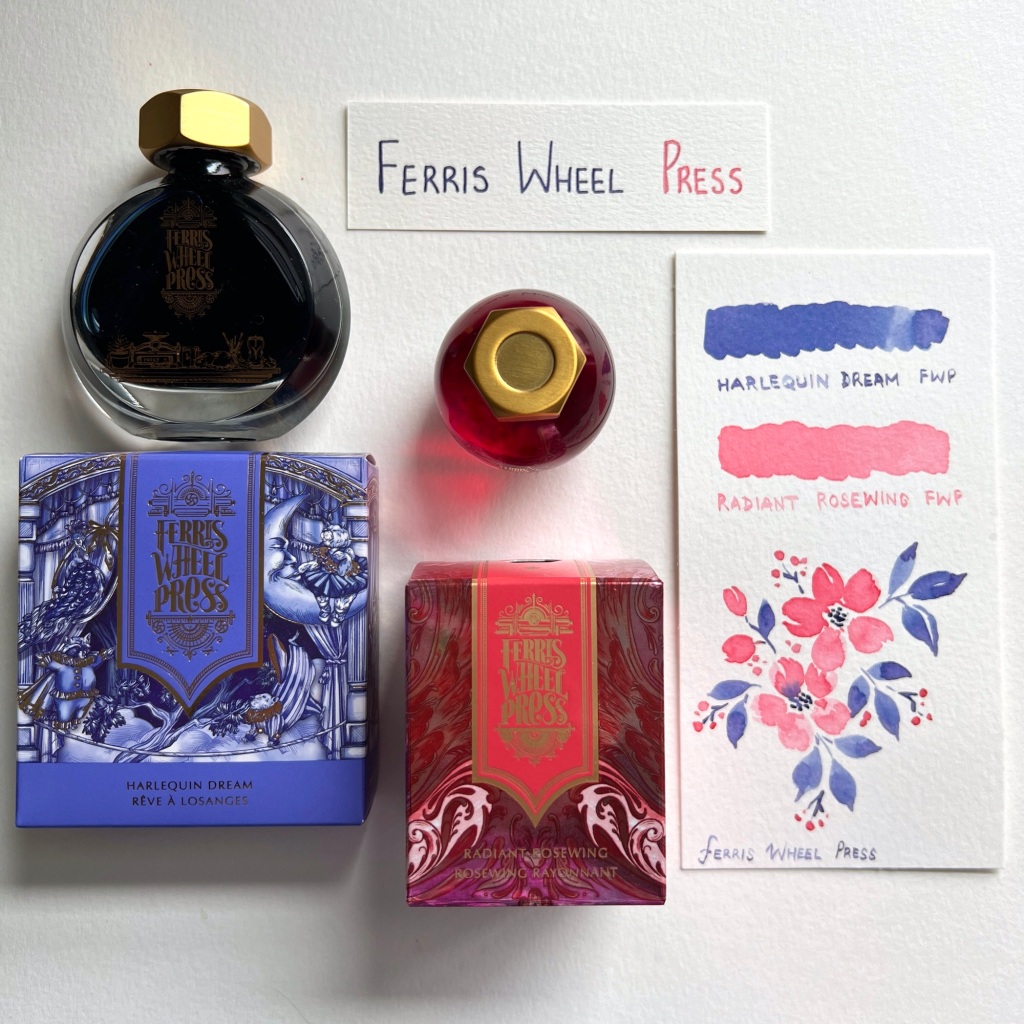
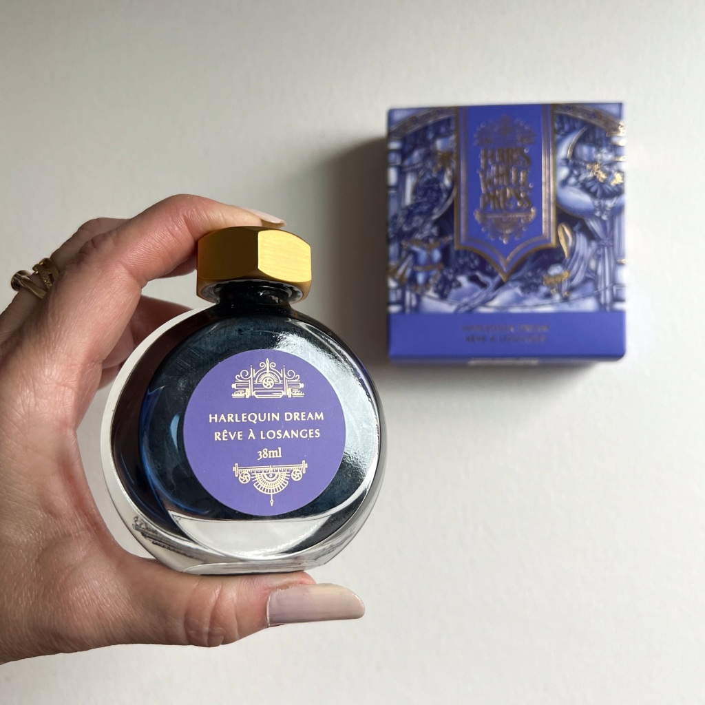
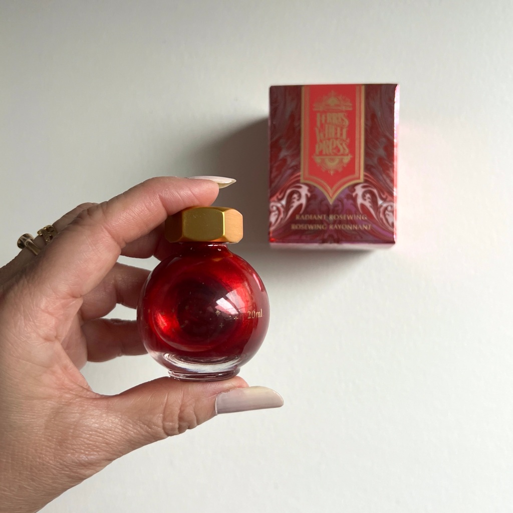
I was so impressed by their beautiful packaging. As I unboxed each bottle and gently shook them, I was mesmerized by the iridescent swirls of gold and the richness of color that unfolded in the elegantly designed glass bottles.

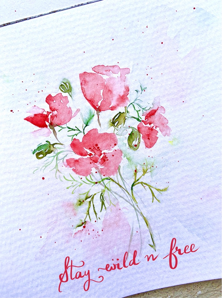
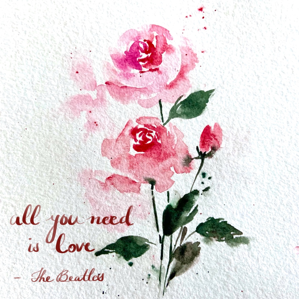
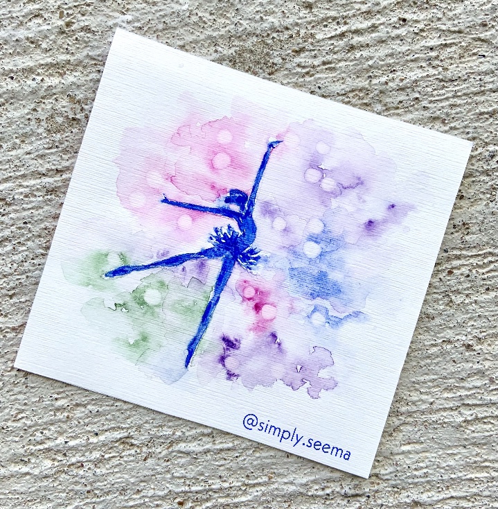
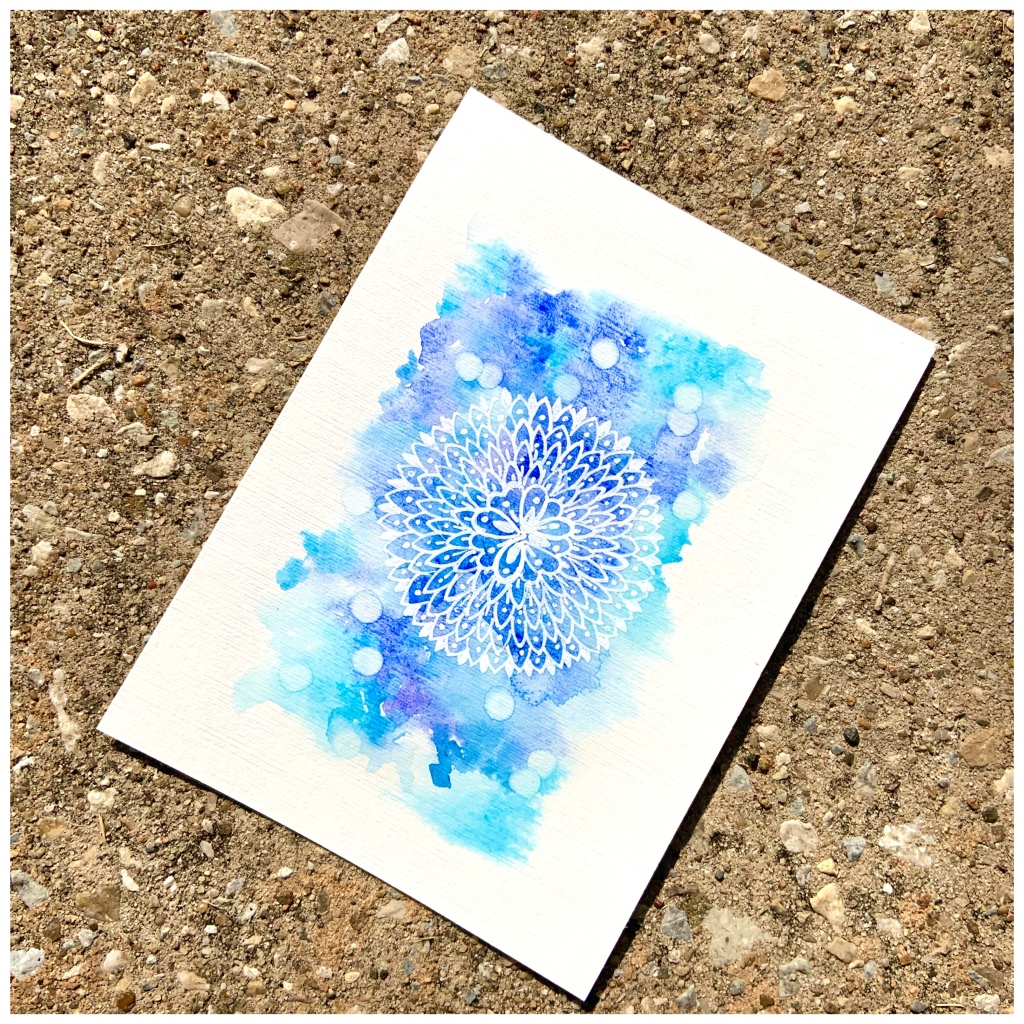
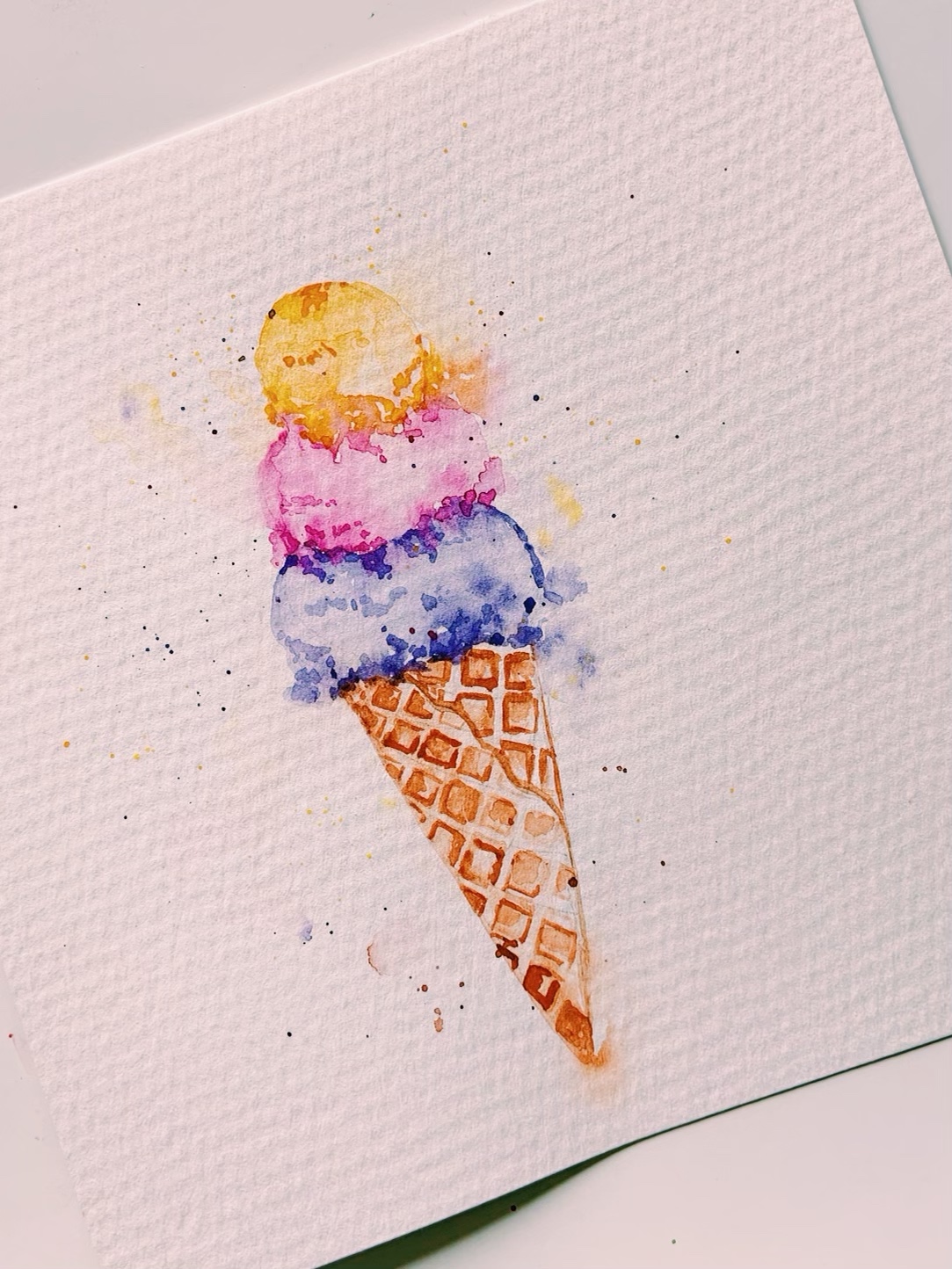
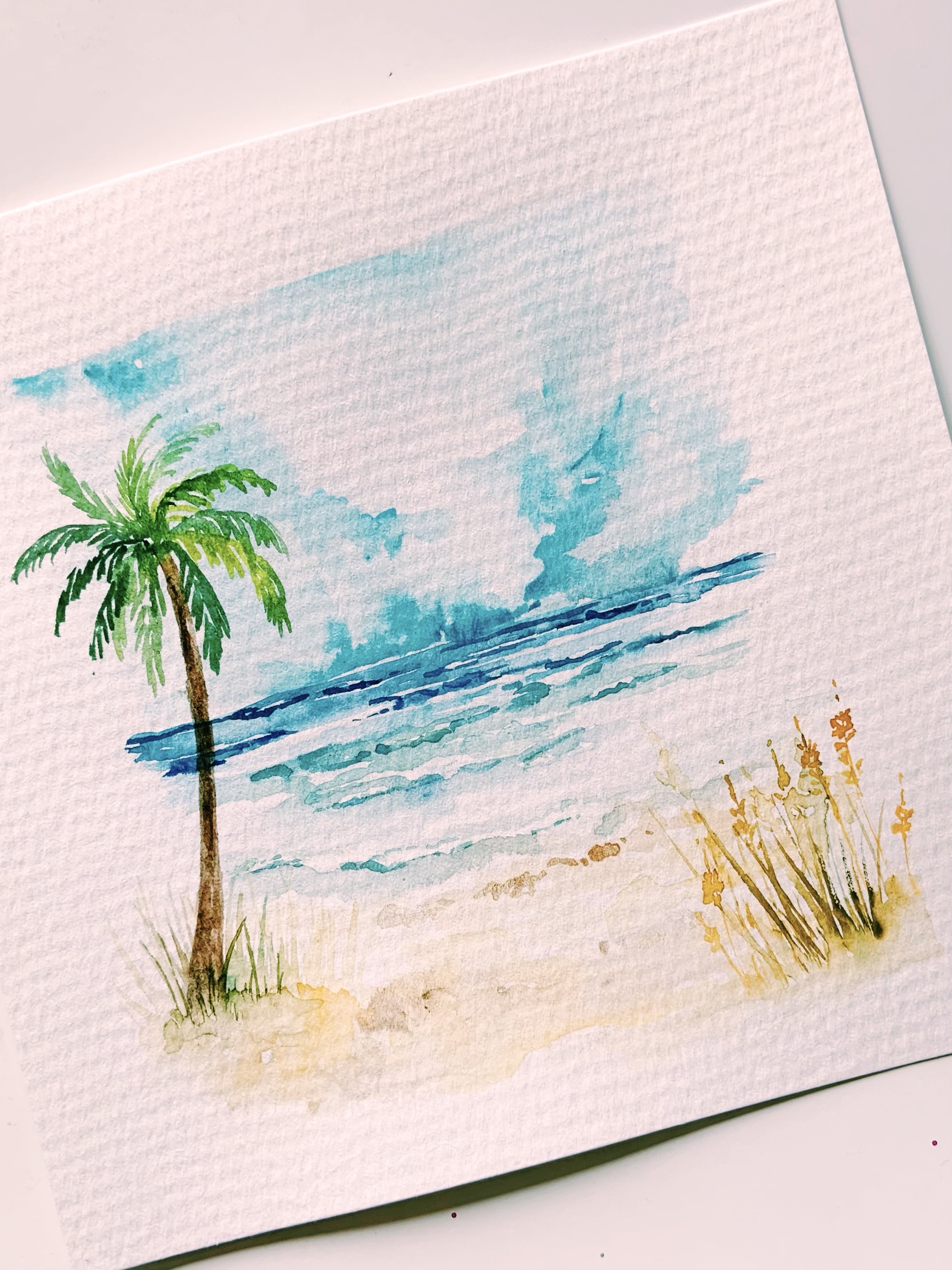
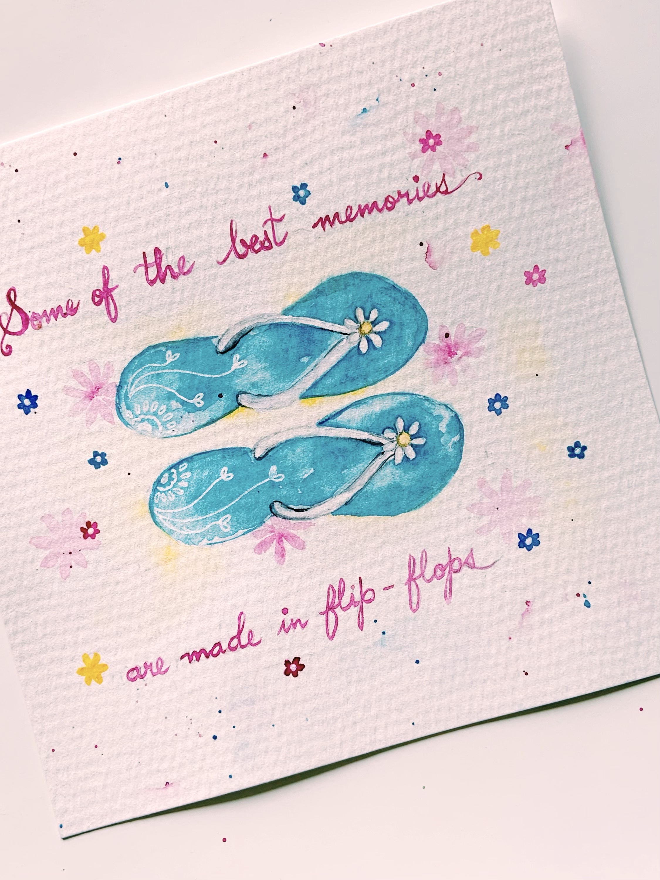
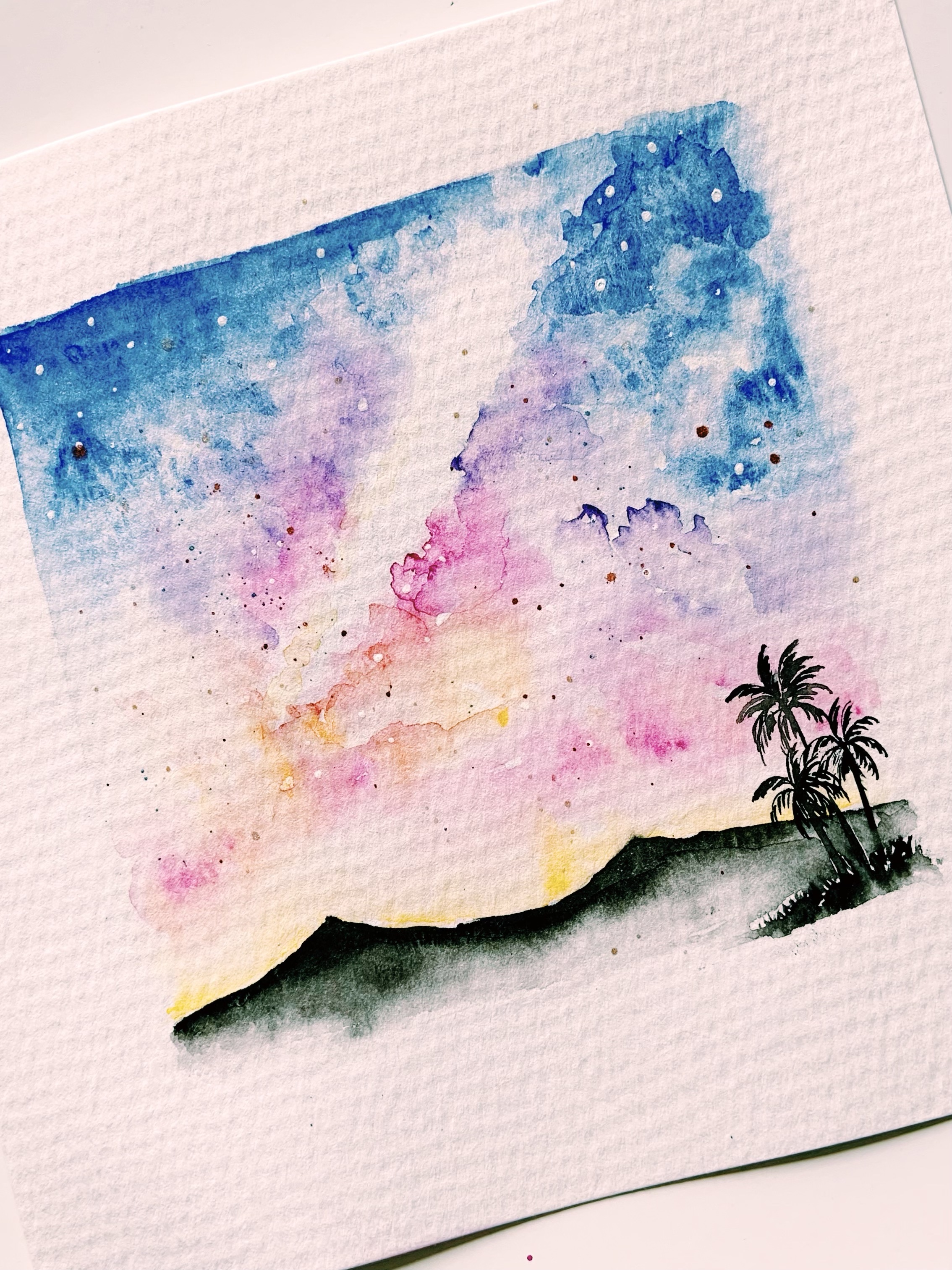
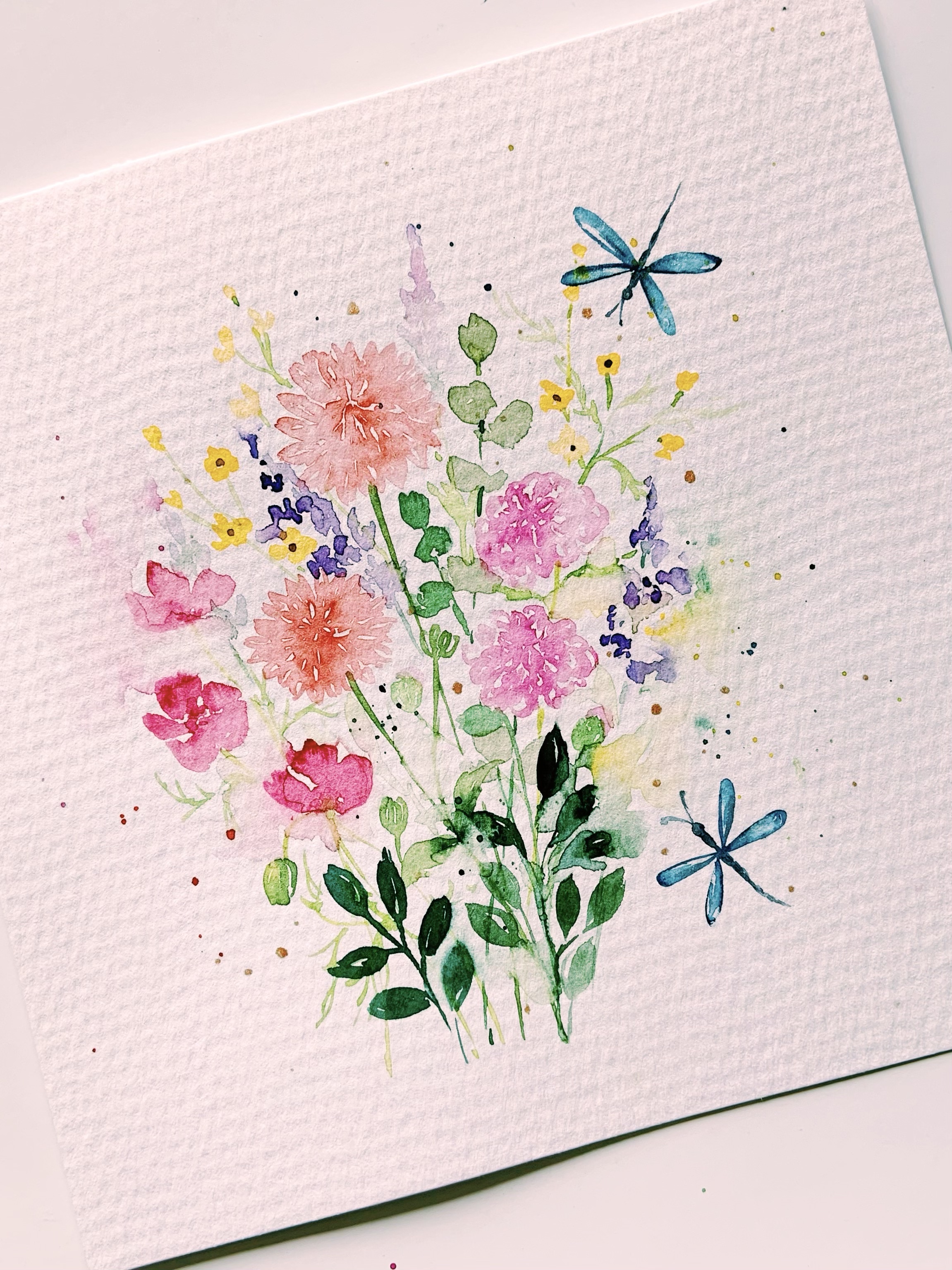
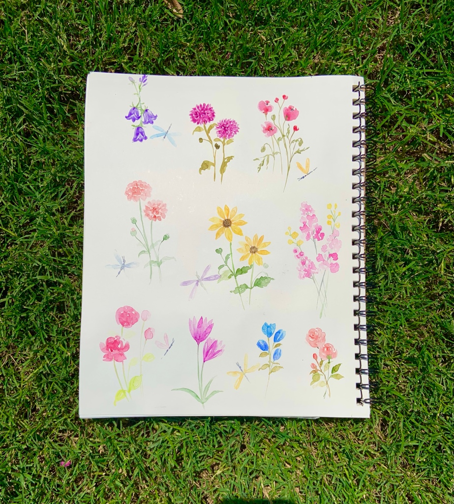
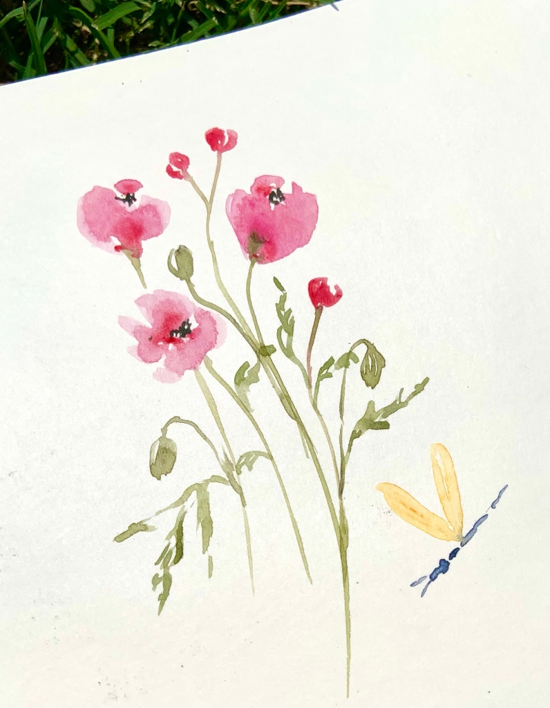
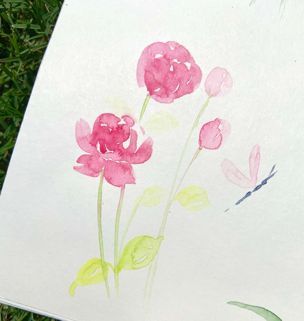
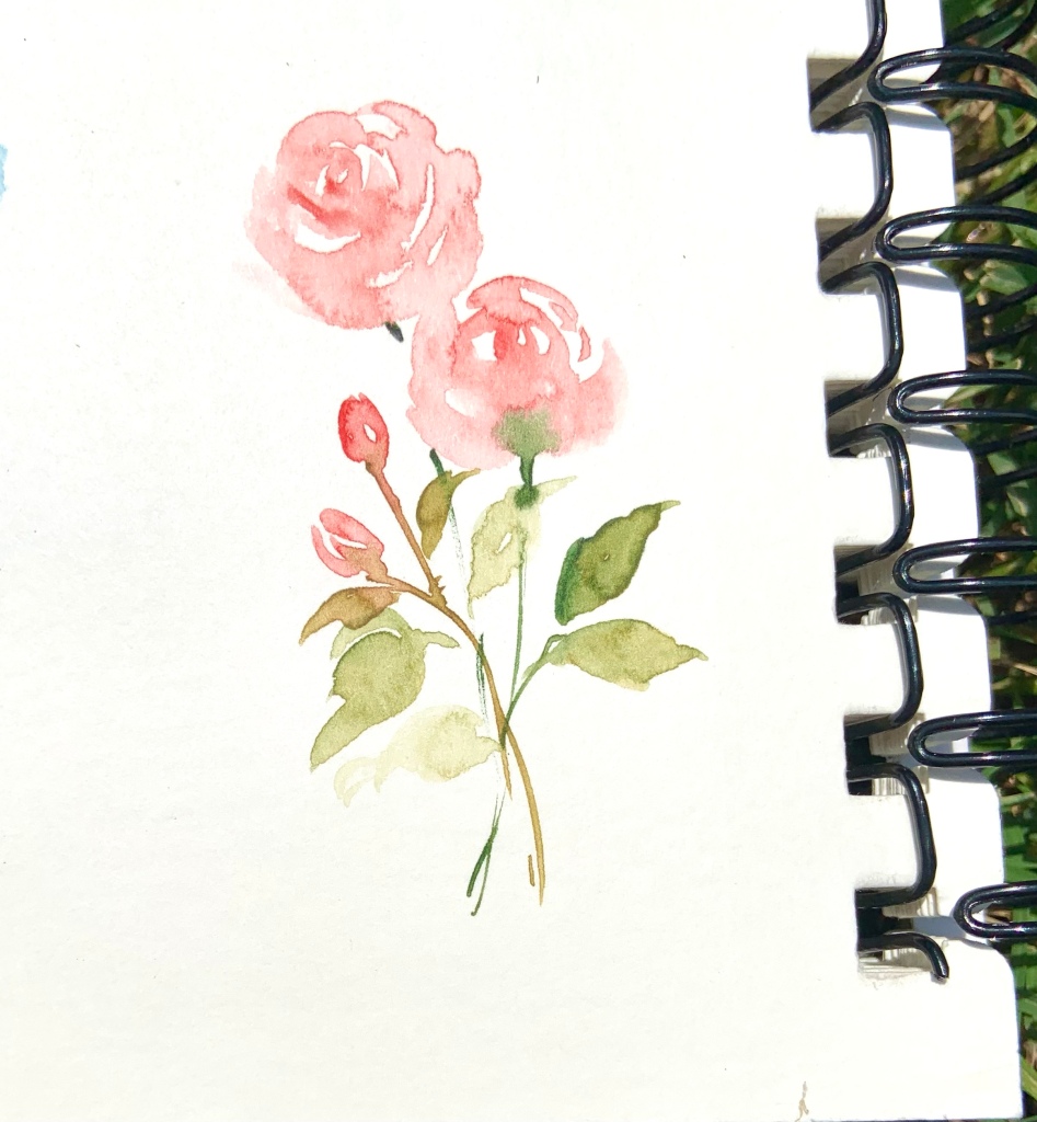
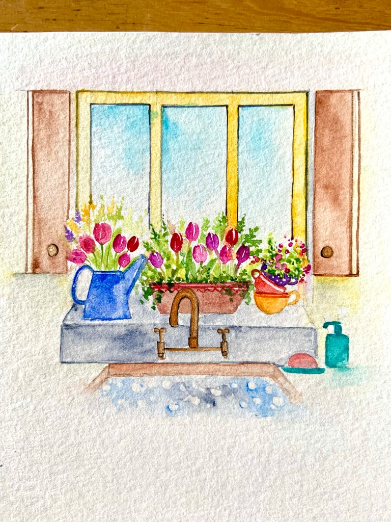
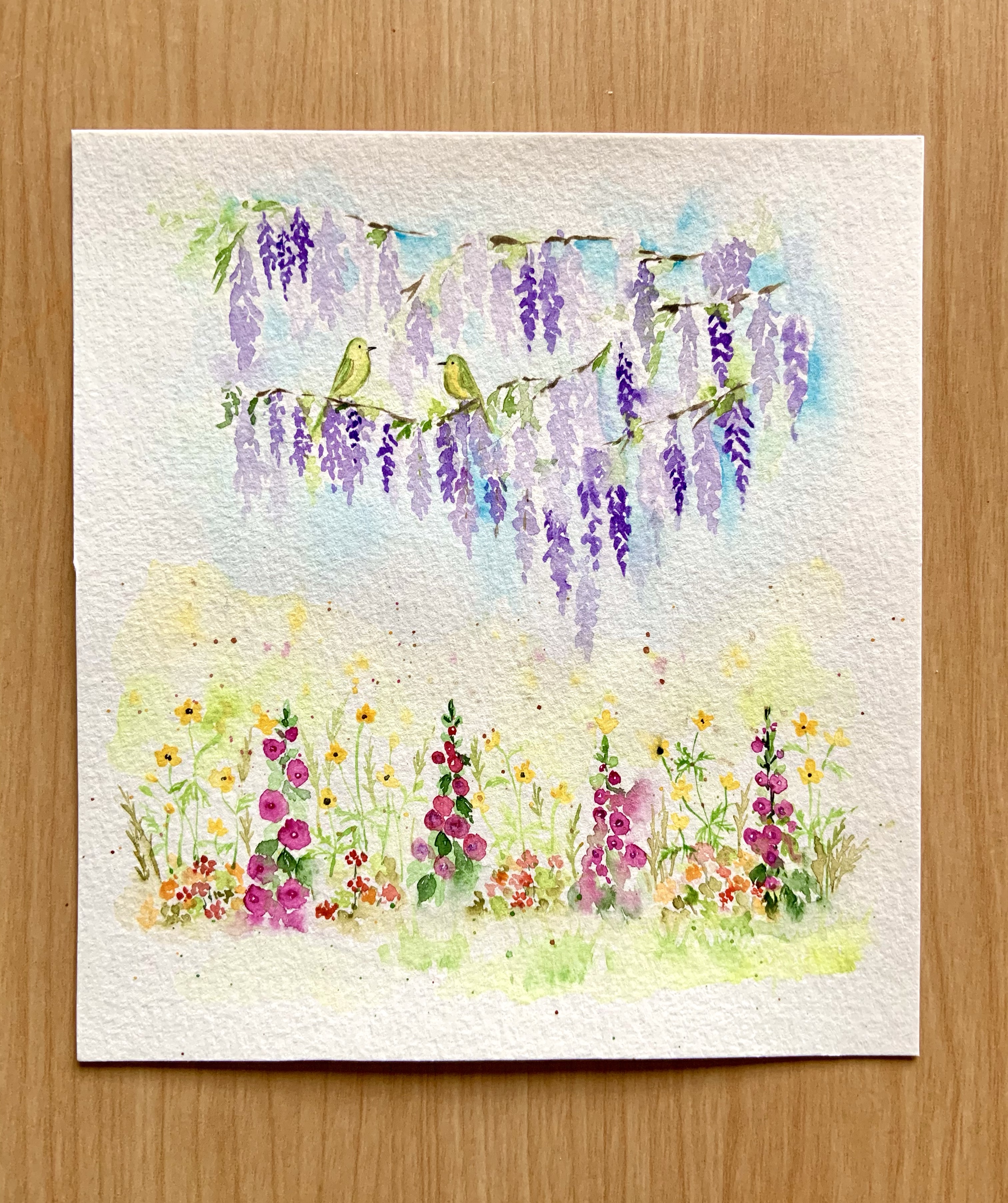
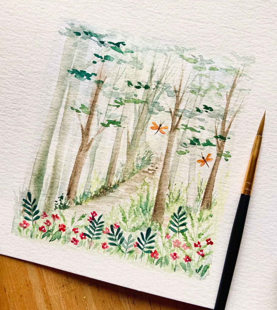
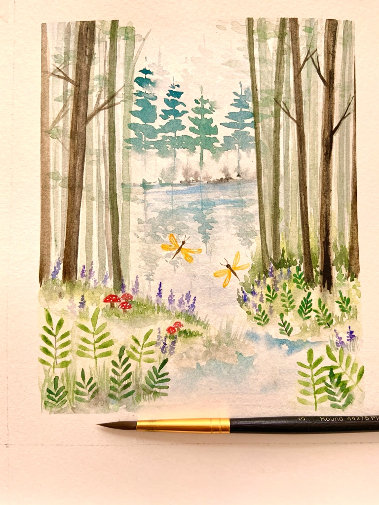
As for the colors, they are so saturated.

Harlequin Dream is a cool toned bluish purple dreamy color that comes in a 38ml bottle
Radiant Rosewing is a pink-gold warm, radiant and uplifting color that comes in a 20ml glass globe.

When you look up these products online, you’ll find little stories mentioned in the description of each color. Yes! fairytale stories that sweep you into a magical world as you swirl these elegant little bottles.

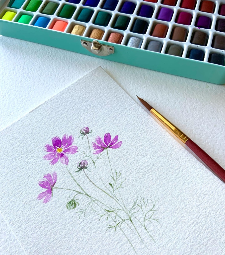
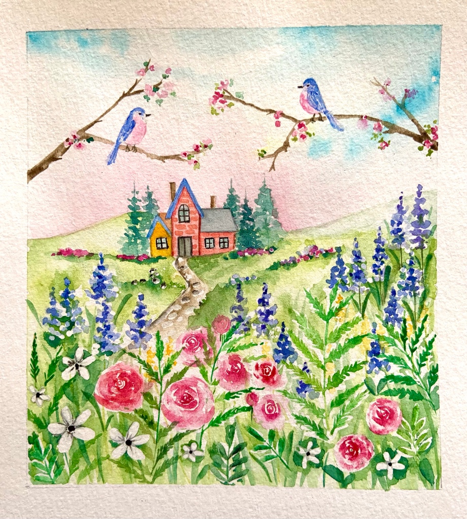
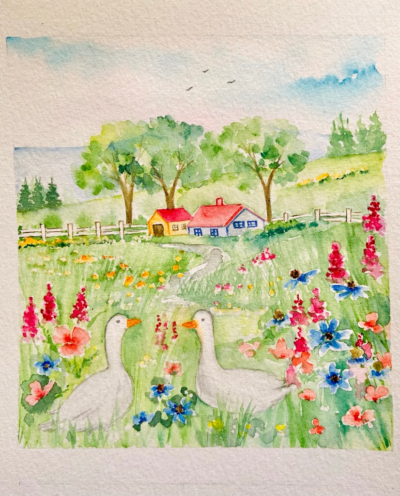
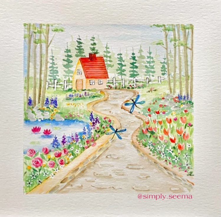
I’m so impressed by the utmost care taken by Ferris Wheel Press in designing and presenting their products. Every color is so unique. Working with the colors is such a joy. Although these colors are designed for fountain pen use and therefore creative writing, they are just as efficient and amazing for painting with brushes! And… they are a dream – beautiful and decently priced.

If you’re a beginner who is interested in exploring inks for creative writing and painting or if you wish to add more colors to your existing collection of inks, check out the link below.

Click the link and your code will be applied automatically!

https://ferriswheelpress.com/?utm_source=Jubilee&utm_medium=Jubilee&utm_campaign=SS

You can also use my Code SS to save 10% from the link in my bio.

Thank you so much for stopping by! If you have any questions regarding these inks, don’t hesitate to ask me in the comment section.

Have an awesome day!

Featured

Autumn themed digital products!

Autumn’s here in her deepest and most vibrant version and Thanksgiving is not very far! So here are a few digital products I’ve created to help you make this season even more memorable!

1. Glorious Autumn digital papers – Fourteen of them! In beautiful fall colors for you to use them in your scrapbooking projects, digital planners, greeting cards, party invites or anything else!

2. Beauty of Autumn digital stickers – 40 of them! Pre-cropped and individual PNGs for you to use them with your GoodNotes planner or other purposes! Cute pumpkins, pretty coffee cups, thanksgiving quotes and days of the week – you’ll find them all here!

So do stop by my etsy shop http://www.etsy.com/shop/designsbyartsygals to see more!

Have an awesome day😍

Featured

Bokeh Ballerina

Continuing with the ‘Bokeh’ effect from my last blog post, here’s another piece you might like. I chose a ballerina this time as my main subject as it is close to my heart…Becoming a ballerina was a childhood dream! So here she is in deep blue in a bokeh cloud…..

Have an awesome day😊

Featured

The Bokeh Effect

Have you noticed that out-of-focus blur while taking a picture?

Do you see the bubble like things in the background of the painting below?

Welcome to the world of Bokeh!

I learned about painting bokeh from an art collab on Instagram where a group of artists came together to create artworks with a bokeh background.

The first time I felt like backing out as I found it very difficult to paint despite watching several videos on bokeh! I had never been this frustrated… neither of the papers I use for my watercolors proved to be useful!

I was about to throw in the towel when I picked up a scrap paper from Canson Acrylic pad (mostly used by my daughter) and decided to give one last try. I cannot express my delight at the sight of the little ‘bokeh’ effects I got right on this paper!

A little bit of the process

  • Wet the paper on different places.
  • Using different colors dab the brush on the wet surface.
  • Add darker colors at some places.
  • Let the paper dry completely.
  • Using a wet brush create small circles here and there. These circles will appear faded or white depending upon how many times you use the wet brush on them. (Don’t overdo it or else the paper may start tearing) you don’t want that..right?
  • Ta-da! Your bokeh is ready!

Hope you enjoyed this post!

Have an awesome day😊👩‍🎨

My summer

So a week ago I hosted a watercolor challenge (on the suggestion of my daughter) on IG! It was a mini challenge with prompts related to my favorite season – Summer! And I’m going to share my work from that challenge. It was a wonderful experience and it was refreshing to see some very beautiful pieces of artworks by talented artists on instagram.

My favorite summer dessert!

I used to love the mountains and streams (and I still do) but the sea has changed me. The wide blue skies, the turquoise waters and the golden beach….need I say more?

I totally believe in this quote by Kellie Elmore. Do you?

What is your favorite thing to do on summer days/evenings? Stargazing is one of my fav activities (not just during summer) and whenever I spot the Orion I’m ecstatic!

Florals are my favorite things to paint not just with watercolors but also digitally on procreate. And dragonflies have become my signature style as I just can’t stop painting them!

Tell me what do you love most about summer? I would really love to hear from you!

Until the next post😀

Featured

Still summer

Hello how’re you all doing? It’s been more than a while since I last posted anything here on WordPress! So here I am sharing something that I most love – my art!

Summery flowers in loose watercolor (my favorite style)

And here are closeups of some of them!

Wild pink poppies
Loosely painted pink peonies
And a pair of peachy roses

Have a lovely weekend😍

Featured

Tulips on the window

A bunch of tulips is what I need to spruce up this little corner in my kitchen and with the bright spring morning light streaming through the windows, everything feels ok…..
…..the simple things!!

I used my metallic gold from the Komorebi watercolor palette for the first time.. on the faucet and the knobs on the cabinets! This was my entry for an art challenge on instagram.

Featured

Happy Earth Day to all!

Let’s continue to reduce (waste), reuse and recycle (whatever we can) and restore this beautiful planet. After all we only have one of its kind!

As an artist I reuse my old or not-so-great artwork by cutting them out and saving them to embellish future scrapbooks or greeting cards! I reuse pickle jars to hold my brushes or water. I also save my old paintbrushes for painting with masking fluid or stirring paint. And I’m desperately seeking a way to create new paper from the discarded pile…

Around the time pandemic started, I turned vegetarian. I bought some sturdy 100% cotton bags to buy grocery. I started cooking more and buying and consuming less processed food. I realized this in itself led to less paper and plastic waste. Using cloth over paper, reusables over disposables was a major turning point!

I’m still working towards living as green as possible. It’s a journey and the goal is to reduce the burden on the planet as much as possible. What I’ve learned is it’s ok to have an occasional slip up (sometimes I forget my cotton bag or have run out of them and sometimes it’s not possible to recycle). It’s the intention and the awareness that matters and that is enough to save our planet.

Have a beautiful day🤗💕🌱🌸🌈🌎

Featured

The cottage in the hills

There’s a sweet little cottage in the hills tucked away near a cluster of evergreen pines. No one knows who lives there!

Each morning a pair of bluebirds meet on the branch of a pink blossom tree. They sing and flutter over the roses, peek under the daisies and peck at the purple lupines. Sometimes they race each other to the chimney on the cottage.

And before dusk arrives, they’re back on their spot on the pink blossom branch. Only they know who lives up there in the hills!

Featured

The Spring Garden

This painting has been inspired by the memory of my grandparents’ garden back in India. There was this river stone studded path that ran from the patio all the way to the main gate.

On either side of that path were fragrant flowers that graced the flowerbeds, a dense litchi orchard and a pretty little pond inhabited by a turtle, some fish and a few lotus flowers.

There was this bright red swing set in the middle of the orchard that my brother and I loved to visit everyday. There were so many secret little places to play hide and seek, fish to observe, bird songs to listen to and the fresh air of the valley to breathe in.

Their home and garden have been renovated since then and a lot of things have changed but the memories of holidays spent at my grandparents have not.

So when a group of artist friends and I picked up a collaboration theme – Spring Garden, my thoughts floated back to those sweet moments spent in a forever spring garden – in the cool shade of the litchi trees where dragonflies followed the fragrance of sweet smelling roses and tulips and one little turtle lazed under the afternoon sun between the lotus blossoms.

Have a great Sunday😊🌸🍄🪴

Featured

A walk in the woods

A path in the woods lined by tall oaks and the scent of wildflowers permeates the air….

Do I hear a babbling brook somewhere?

Finally a clearing…bluebells and wild mushrooms lining a clear stream and the scent of fresh pine in the air…..

Did you enjoy this stroll in the woods?